Seaport
It is about time that I start to update the game’s business units; and the seaport has the privilege to be the first one. I have increased its size considerably as a seaport is a rather large building to start with. Other than the visible changes to its layout and its model+animations (which is still a work-in-progress) most other changes were under the hood. But work on the seaport will continue for the next release.

Build Markers
By increasing the size of the seaport it became harder to find a valid spot to build it. Thus this release introduces markers, which business units can opt-in to, to be displayed during build-mode. While this would be redundant for buildings that can be built on plain land, it will come in handy for other buildings. It already pays off for the seaport and it most likely will for buildings extracting natural resources.

Status Icon v2
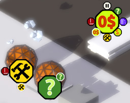
With the introduction of status icons in the last release it was necessary to iterate on the idea some more. So let me introduce you to the final iteration of them:

Getting there was not straightforward, but after understanding the problem I was trying to solve it was only a matter of settling on a design for the graphics. In the end I realized that there are two important states that need to be communicated, but a third one can function as a handy reminder:
- Let’s start with the ‘handy reminder’, which is the blue pause symbol. This represents, what I call: ‘production voluntarily halted’ and should be rather self explanatory. It is displayed when the player chooses to pause a building.
- Of course there has to be the opposite: ‘production involuntarily halted’, which is represented by the red icon with the exclamation mark. This is shown when the building is unpaused but not producing anything, which can happen when a required resource or enough money is not available, no storage space is available to store the produced goods, the building does not know what to produce &c. The details are not important when displaying the icon, since solving the issue requires to open the building’s detail window anyway, which in return can better display what is going wrong.
- The question mark enclosed in an orange circle I would call ‘warning’. It means that the building is going about its daily business, however something seems fishy. For example the business unit is running a deficit, or the production falls below a certain threshold of its capacity.
- Construction is an orthogonal concept, but there is an icon for that as well (it is only shown when no other icon is active). Contrary to the other states it is not binary but represents progress; thus whenever construction is going on at a site a circular progress bar is displayed surrounding the active status icon. It increases in 12.5% steps for .. reasons. It even supports up to 4 different progress bars at once, each having a slightly different color. So if multiple upgrades are under construction, the progress for each one can be displayed at the same time.
Originally I wanted to have different symbols for certain states of a business unit: ‘no input’, ‘storage full’, ‘not enough money’, ‘paused’ &c. Since multiple states can be active at the same time I needed a way to display them concurrently. Somewhere along the line I came up with this: every status having a fixed color and position along the outside of the octagon to quickly see which states are in effect, while the center icon cycles through each status icon, only bigger, for those who are not yet familiar with the color and location of the icons. But I think that was a rather stupid idea. For the uninitiated it took 700 ms per icon to cycle through, so for 4 active status icons that were 3 seconds of waiting to see all of the active status icons. Besides, it resulted in a convoluted mess of icons and colors; in no way simple, easy to understand or pleasant to look at.
Shadow Optimization and Fixes
For this release I took a closer look at the shadow-related GPU code, since it was the biggest outlier. And it paid off, partially. The compute shader doing the silhouette detection and building the actual shadow volumes is now much faster. On a GTX960 it is down to around 1 ms; previously it took somewhere around 5 ms.
Unfortunately I had not so much luck on the actual rendering side of the shadow volumes. Instead of sending triangles outside the view frustum to the graphics pipeline (getting culled as a result) for edges that are not casting shadows, I omit outputting any data for them at all. However this had no significant influence on actual rendering times. Though I could notice a bit of an improvement after outputting sanely sized quads instead of triangles spanning to infinity. Looks like I am very much fill-rate limited, not memory bound. Which is a bit surprising since every shadow casting edge transforms into 6 vertices (= 96 bytes). That are 45 MiB for only 500'000 shadow casting edges, written and read every frame. I guess, not using textures leaves me with the memory bandwidth available for other things. In any way, I still need to find a way to reduce the rendering time of shadow volumes considerably. Right now it takes up to half a frame’s total time, depending on scene composition, and this is simply too much.
To end on a positive note though: through rewriting big parts of the shadow related code the long standing bug of AMD GPUs not being able to render shadows for static meshes is now .. gone. (I would love to say ‘fixed’, but since it is just not there anymore because of the changes, I cannot claim that.)
Miscellaneous Changes
The total number of clouds in the world was reduced. During the last release I increased their number considerably, resulting in heavy CPU usage on the renderer side. Down the road it will most likely be necessary to move clouds out of Lua and into a dedicated code path in C.